Foundation funding by state: Where do grant dollars come from and where do they go?
Use Candid’s free dashboards to learn how billions in grant dollars flow in the U.S., and compare foundation funding by state with data on foundation grants given and received by nonprofits in each state.

Foundations award billions of dollars in grants across the United States each year. One question we often hear is: Where does all that funding come from, and where does it go? Now, with Candid’s two new dashboards—Grant recipients by state and Foundations by state—on Tableau Public, you can explore both questions for yourself.
The dashboards’ maps and graphs show grant dollars from two complementary perspectives: funding awarded to nonprofits in each state, and funding awarded by private and community foundations based in each state. This is an important distinction because, for example, the Bill & Melinda Gates Foundation is based in Washington State but awards grants to nonprofits in many states across the country.
Why does this data matter?
For nonprofit staff, knowing about trends in foundation funding by state can help with development planning and grant applications. Foundation staff can identify gaps and concentrations in funding by state and measure how their grantmaking compares with broader national distribution patterns. And policy makers can use this data to develop better policies to support nonprofits based on the current funding landscape.
By making this data available for free, we hope to increase transparency in philanthropy and help organizations make informed decisions about the distribution of resources nationwide.
How to use these free dashboards
First, determine which interactive dashboard to explore, either starting from where foundations are based or where nonprofits are based. Next, click through the tabs at the top to move through the different visualizations; each dashboard includes the same four tabs. In the “Map,” “Trends,” and “Subjects” tabs, you can explore funding patterns by state from 2019 to 2023. The “About” tabs offer more information about the underlying dataset for each dashboard.
Ready to jump in? Here are three things you can learn using the dashboards:
How does foundation funding in my state compare with other states?
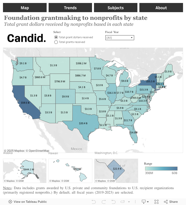
This view of the dashboard shows the total amount of grant dollars received by nonprofits in each state from 2019 to 2023. Feel free to adjust the filters here to customize your view, or explore the complete recipient dashboard on Tableau Public.
In the “Map” tab of either dashboard, you can easily see which states are awarding or receiving the most—and least—foundation funding for each year between 2019 and 2023, over multiple years, or for the entire five-year period. Not surprisingly, the distribution of grant dollars generally reflects population density, with California and New York consistently awarding and receiving the largest amounts.
You can also choose to view total grant dollars or number of grants to gain different perspectives on funding flows to a state (on the “Recipients” dashboard) or from a state (on the “Foundations” dashboard). And you can compare the two maps to see whether nonprofits in your state receive more grant dollars than foundations in your state award, or vice versa.
Whether you’re a development professional assessing how grantmaking to your state compares with neighboring states or regions, foundation staff evaluating your geographic impact, or a researcher studying the sector more broadly, this “Map” view provides valuable context at a glance.
How has foundation funding in my state changed over time?
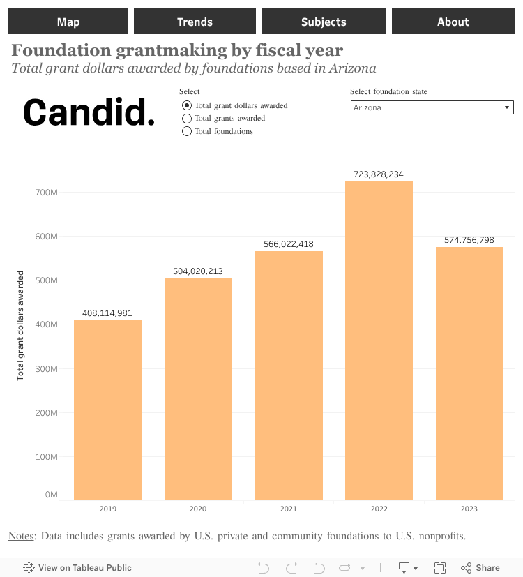
This view of the dashboard shows the total amount of grant dollars awarded by foundations in a single state, Arizona, from 2019 to 2023. Feel free to adjust the filters here to customize your view, or explore the complete foundation dashboard on Tableau Public.
On the “Trends” tab, you can see how foundation funding to or from your state has evolved between 2019 and 2023. Based on the foundation grants Candid tracked, nationwide, total foundation funding increased steadily each year during this period, from $64 billion to $94 billion. However, an analysis of foundation funding by state uncovers different regional patterns. For example, in Arizona, funding by the state’s foundations notably increased from 2021 to 2022 and then declined in 2023.
Beyond grant dollars, you can also look at trends in the number of private and community foundations awarding funding, of nonprofits receiving funding, or of grants awarded or received.
By understanding state funding patterns, you’ll have key insights to use in your fundraising strategies, impact reports, or policy discussions.
Which subject areas are receiving foundation funding in my state?
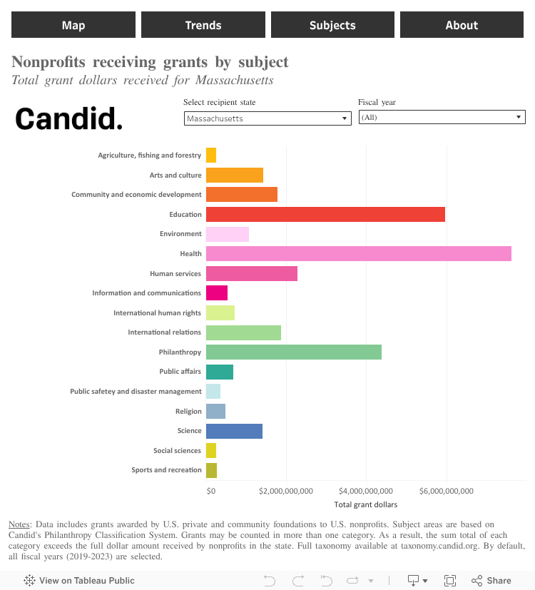
This view of the dashboard shows the total grant dollars received by nonprofits in Massachusetts from 2019 to 2023, broken down by subject area. Feel free to adjust the filters here to customize your view, or explore the complete dashboard on Tableau Public.
The “Subjects” tab reveals the focus areas receiving foundation funding in each state. In Massachusetts, for example, health and education nonprofits receive the most grant dollars, reflecting both the state’s academic and health care infrastructure and foundation priorities in the region.
Development professionals can use this data to understand which subject areas are saturated or underserved in their state and fundraise more strategically. Foundation staff can compare their grantmaking by subject area with broader state patterns to assess whether their funding aligns with needs.
These dashboards can help you identify patterns and gain practical insights—whether you’re comparing foundation funding by state, tracking trends over time, or analyzing patterns by subject area. We invite you to dive into the data and discover the stories and opportunities most relevant to your work.
About the authors
